Willem said...
Michael,
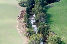
I think you are misintepreting the figure. It is still possible that is a mock-up.
What you are looking at are the values on the contour lines, there are actually no real data points in the plot, although they are suggested by the "bomb craters". The contour lines might suggest the same values, but they are the result of the spatial integration that was used to make the plot and thus represent some sort of average between points.
Willem
Hi Willem,
I stand corrected. If those values on the control plot are contours or 'isobars', that would account for them. But the caption implies otherwise. The average reader is not a scientist. It is "A Farmer's Guide". However there is no evidence that the map is a 'fake'. Just opaque. I withdraw the comment and apologise.
The significance of this "illustration" - whatever it is - must be understood: it appears to be a powerful argument against trading in soil carbon. It is an obstacle. Some people have invested enormous amounts of time and money identifying and publicising obstacles to the trade in soil carbon. Why have they not invested the same resources in searching for ways to remove these obstacles? Given the benefits to society that the 'recapitalising' of our degraded soils would bring, who does this obstruction benefit? If President Kennedy was relying on people with this attitude to put a man on the Moon, he would have heard: "Sorry. Can't do it. It's too hard."
Subscribe to:
Post Comments (Atom)


No comments:
Post a Comment